Talco Construction is a roofing company that specializes in commercial roofs. They wanted to drive more residential leads and needed the website to focus on this new initiative. The issue was that there was no real design and development plan or focus on user flow. That is where Lusca Digital came in.

Their initial website used WordPress with a page builder and most pages were built out. The issue was the design and user flow focused on the radio show and driving traffic to that initiative. While the radio show is a great lead generator, the radio show should lead traffic to the website, not the other way around. The website revision plan was to drive traffic to roof information and have potential customers fill out a contact form.
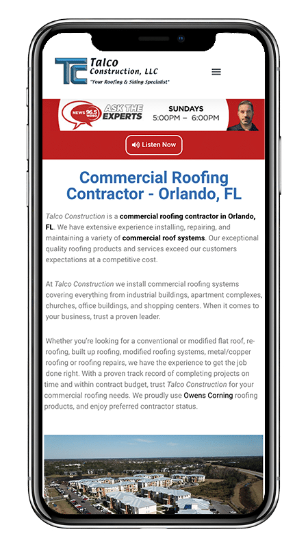
The good part was that we did not have to rebuild the entire site but simply move things around to create a better user flow. We majorly reduced the size of the banner and moved more content above the fold. We added a slider with images that highlight both commercial and residential roofing. We also reformatted most of the pages to have a cleaner user experience and reformatted the blog. We also put strong call to actions on every page to collect leads.
The website now has a better overall look and feel. The usage results prove that the users like it. With the new website design and Rocket Chimp managing their ads, Talco Construction collected over 400 new leads during the initial relaunch which is a significant increase month over month.

Besides making sure all the images are sized and properly optimized for fast load times, we also made sure every page looks good on multiple device sizes. The reason these two things are important is that you want the images to look good when loaded on a giant monitor, but not make a phone with a smaller processor take too long to load the page. This would effect the SEO and more importantly be a bad experience for the user.
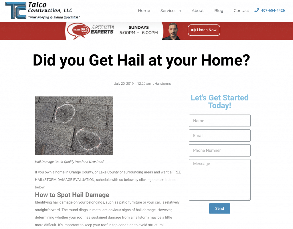
Talco created some insightful posts like this one about how to spot hail damage. This boosts SEO as people search for answers. Their layout was not as strong as it could be, so we cleaned it up and added call to actions on every page. The idea is that when people get their roof and construction questions answered, their next step is to call Talco!


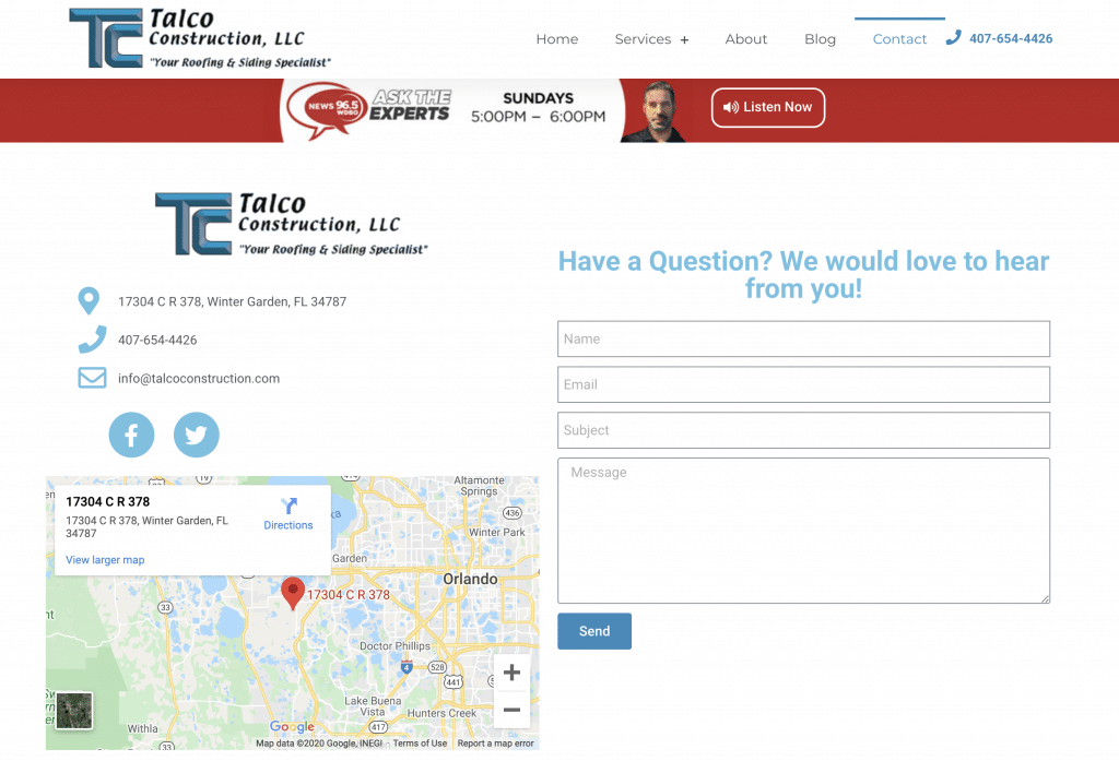
Previously, their contact page was a straight form. While it was functional, it was not visually enticing and there was some information missing. It is important to provide your customers with all the information they need about your business. If they click contact, there may be some people looking to fill out a form, but some might be looking for the address, phone number or email. It is important to give them everything in a clean, readable layout and that is exactly what we did with this website.
Ready to get started on your project?